admin4 components
This page is for designers and developers who build an administration page, in the kernel or in an extension. The
administration has a small component library: classes with the prefix .a4- in design/admin4/stylesheets/components.css
(identical copy in design/admin). The full reference is the "Components" section of
Admin styling; this page is the overview.
Contents
Use them first
The rule for every admin template: reuse the shared classes before writing any CSS. They are already light and dark, right-to-left aware, keyboard accessible, and loaded on every admin page. New CSS of your own is the exception (admin4 module stylesheets).
The main components
| Need | Classes |
|---|---|
| A module page wrapper | .a4-page (reset, font, links, focus ring) |
| Page title and actions | .a4-pagehead with .a4-pagehead-title, .a4-pagehead-actions |
| Boxes | .a4-card (.a4-card-head, .a4-card-title, .a4-card-body, .a4-card-foot), .a4-cards |
| Buttons | .a4-btn, .a4-btn-primary, .a4-btn-danger, .a4-btn-ghost, .a4-btn-small, .a4-btn-icon; .a4-actions for a row |
| Action bars | .a4-toolbar (.is-bottom, .is-sticky) |
| Filters above a list | .a4-filterbar |
| Forms | .a4-form, .a4-field, .a4-label, .a4-input, .a4-field-error, .a4-error-summary, .a4-check, .a4-radios |
| Tables | .a4-table-wrap around table.a4-table |
| Labels | .a4-tag, .a4-badge (.is-ok, .is-warn, .is-bad, .is-info), .a4-status |
| Messages | .a4-notice (.is-ok, .is-warn, .is-bad, .is-info), .a4-empty for an empty list |
| Disclosure | details.a4-fold, details.a4-confirm |
| Paging, tabs | .a4-pager, .a4-tabs |
| Icons | .a4-icon with .a4-bi-<name> |
| Utilities | .a4-sr-only, .a4-muted, .a4-meta, .a4-num, .a4-nowrap, .a4-code |
A page built from them
<div class="a4-page">
<div class="a4-pagehead">
<div class="a4-pagehead-main"><h1 class="a4-pagehead-title">'Reports'|i18n( 'design/admin/myext' )</h1></div>
<div class="a4-pagehead-actions"><a class="a4-btn a4-btn-primary" href='/myext/new'|ezurl>'New report'|i18n( 'design/admin/myext' )</a></div>
</div>
<div class="a4-card">
<div class="a4-card-head"><h2 class="a4-card-title">'Last runs'|i18n( 'design/admin/myext' )</h2></div>
<div class="a4-card-body">
if $runs|count
<div class="a4-table-wrap"><table class="a4-table">...</table></div>
else
<p class="a4-empty">'No runs yet.'|i18n( 'design/admin/myext' )</p>
/if
</div>
</div>
</div>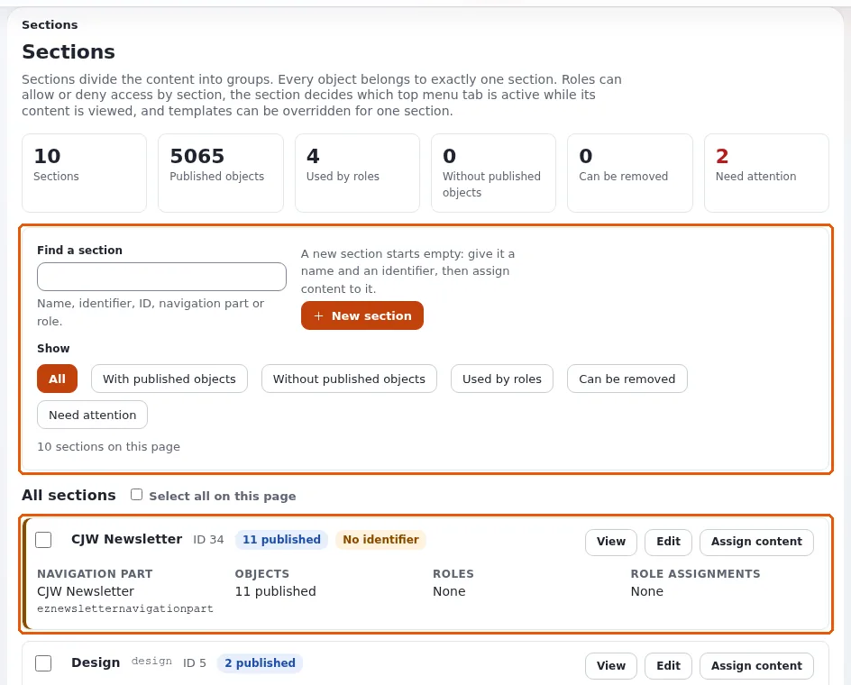

No <style>, no style="", every color from tokens through the classes.
States and weight
States are .is-* classes on the component (.a4-card.is-warn). Each component is one class plus at most an element
or a state, so a module rule with one more class always wins, and components win over the old base element rules.
Related pages
- admin4 tokens
- admin4 module stylesheets
- Admin designs overview
- Free documentation: this page is free to copy, translate and improve under the GNU FDL 1.3.
Become an Exponential Partner
Partners share their information, provide funding, contribute back and develop the products with us, and that is how Exponential grows. A partner website and dashboard are planned for mid-2027: please become a partner today to speed up our growth rate and land new features faster.